The A1 Blog

Prints, Patterns, & Pairings
of the In-Between Season

The Fall Story:
September Edition

September sits in an interesting place on the event calendar. The richness of fall is beginning to creep into the landscape, but summer isn’t gone yet, meaning there is still plenty of room for lighter color, softer texture, and a sense of freshness. For A1, that transition became the starting point for our September assortment.

Rather than looking at September as simply the beginning of fall, we looked at the season as an opportunity to layer different expressions of it. Our selected prints reference the season in very different ways. Our woven fabrics bring texture and dimension to the palette, and our color selections were chosen to connect those elements, giving our customers a broader range of cloth to work with as they build their own looks.

The result is a collection that can feel botanical, refined, playful, classic, earthy, or unexpected depending on which pieces come together.

 

The Print That Starts the Story
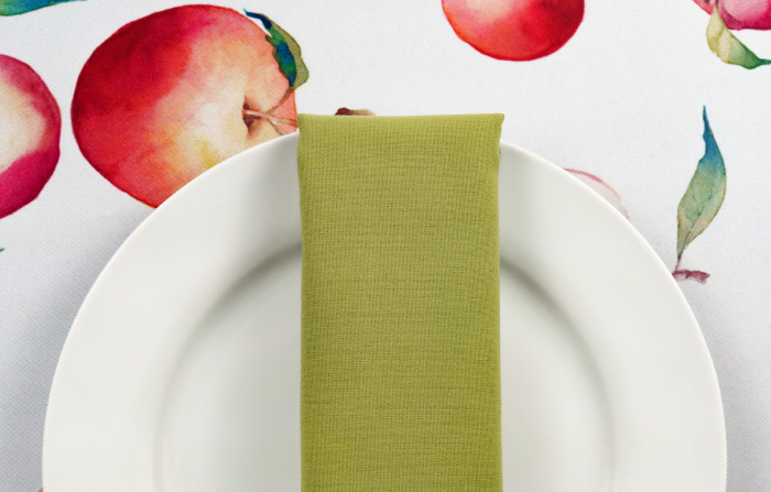
Crisps

There is something inherently September about apples. They suggest the beginning of harvest season and the shift toward fall, but they don’t carry the same heavy visual associations as pumpkins, leaves, or traditional autumn motifs.

Crisps is an especially interesting seasonal pattern that acknowledges the time of year
without dictating the entire aesthetic of an event.

Surround Crisps with quieter solids and textures and it becomes the statement piece of the event.
When incorporated in a larger design, Crisps becomes a key layer within a more unexpected combination.


A Palette Built Around Pattern

The colors selected for September were not chosen simply because they “look like fall.” They were chosen to support and pull from the prints and woven fabrics in the collection.

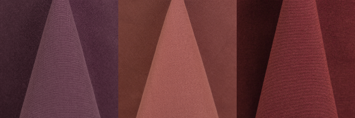
Soft beige and ivory create a neutral foundation. Light olive and forest green bring in the organic quality that runs throughout several of the patterns. Midnight navy, brown, burgundy, and claret provide depth,
while copper, burnt orange, and gold introduce warmth.

Then there are the less expected shades: dusty rose, claret, and burgundy.

These out-of-the-box colors play an important role because they keep the assortment from becoming a predictable autumn palette. They create contrast against the greens and browns, and offer a way to take some of the richer patterns in a more sophisticated or unexpected direction.


From Botanical to Graphic

The varied assortment of prints provide movement through several different interpretations of the season.


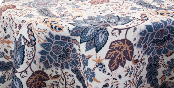
Cambridge

With its layered floral and botanical character, Cambridge feels organic while incorporating a broader range of color. It has the familiarity of a traditional floral, but its combination of muted blues, warm neutrals, and deeper accents
gives it plenty of versatility.


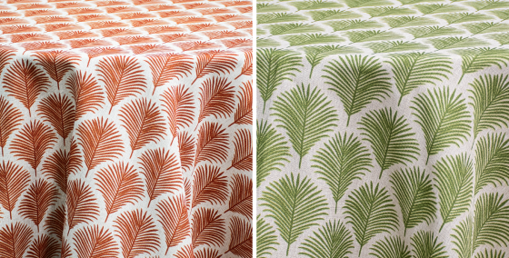
Nassau on Flax

Nassau takes that botanical idea in a different direction. Its repeating form feels more graphic and contemporary,
while the evergreen and rust color options connect naturally to the September palette. Together, these patterns
demonstrate two very different ways to bring nature into an event: one more expressive and painterly,
the other more structured and rhythmic.


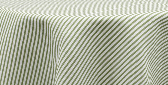
Morgan Stripe

Introduces a quieter, more linear element. Its subtlety makes it an interesting contrast to the
more expressive prints in the assortment.


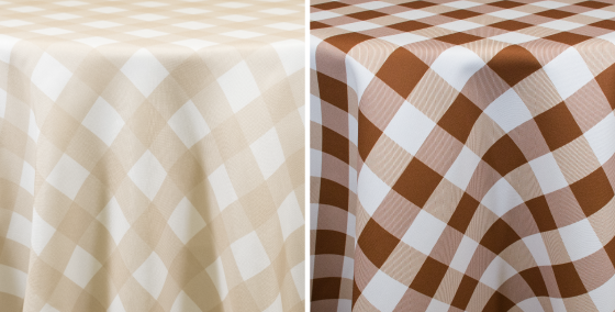
Buffalo Check

Brings a more familiar seasonal reference. The pattern has a longstanding connection to fall.  Against the right solid or woven fabric, Buffalo Check can feel classic autumn. Paired with a rich, deep color, it can become much more editorial.


Where the Wovens Come In

The selected patterns give the September collection personality; the woven fabrics give it depth.

This was an important consideration in selecting the assortment. Solid color provides the foundation, pattern introduces visual interest, but woven texture changes the way the entire collection feels.

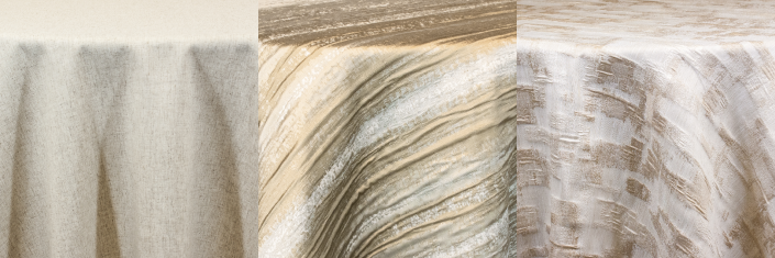
Raw Silk Linen brings a natural, tactile quality to the collection. Its subtle texture allows a neutral or muted shade to have presence without relying on a bold pattern.

Other woven textures such as Shibori Stripe and Brushstrokes create visual interest through the cloth itself. The effect is quieter than a large-scale print, but it still gives the table something to look at and gives the color more dimension.


When the Pieces Start to Talk to Each Other

The most interesting combinations happen when the prints, wovens, and solids begin pulling from one another.

A deep forest green reinforces the botanical quality of the Nassau print. Midnight navy brings out the cooler tones within Cambridge while giving a softer palette more depth. Copper or burnt orange echoes the warmth found within a floral or check pattern without turning the entire design into a traditional, expected fall palette.

The quieter fabrics have an equally important role. Beige, brown, and textured neutrals can give a statement pattern room to breathe. A woven fabric can sit between two stronger colors and create a visual pause. This is where we see the real potential of the September assortment: not in one prescribed combination,
but in the number of relationships between the pieces.


A Different Take on Fall

There is a temptation to define fall through a very familiar group of colors and patterns: orange, brown, burgundy,
leaves, pumpkins, checks. Those elements certainly have their place, but September gives us an
opportunity to stop short of that full autumn expression.

We’ve selected patterns with different personalities, woven fabrics that bring dimension,
and a color palette broad enough to connect them in unexpected ways.

That’s the story we’re telling with September at A1: 
not summer, not quite fall, but a collection of cloth designed for everything in between.