The A1 Blog
Chapter 3
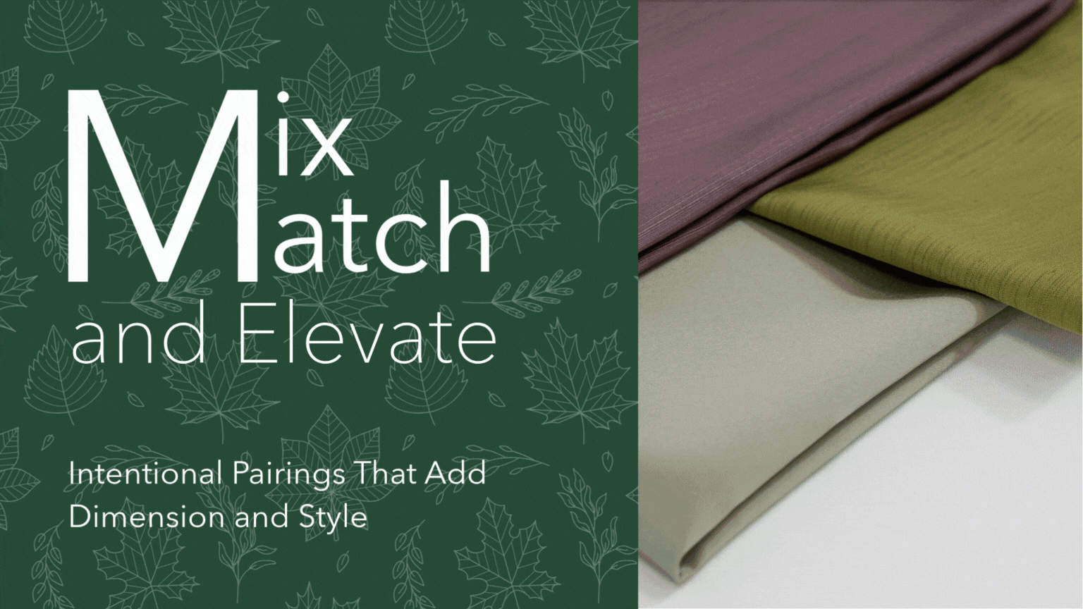
SETTING THE MOOD WITH
PERFECT PAIRINGS
Creating Depth & Warmth for Fall Events
Last week, we introduced six color families designed to reflect the feeling of the season, each rooted in color theory and brought to life through A1’s expansive fabric collection. Now, we’re taking that story one step further.
This chapter explores how Perfect Pairings, carefully chosen complementary colors, enhance and expand each family’s design potential. These combinations aren’t just aesthetically pleasing; they’re grounded in strategy, helping you add richness, contrast, and versatility to your tablescapes, backdrops, and seasonal settings.
While each of A1’s six Fall 2025 Color Families stands strong on its own, the true magic often lies in the pairings that surround them. Great design isn’t just about choosing a palette. It’s about building on it with intention, adding layers that elevate, balance, and sometimes even surprise.
Complementary color combinations bring fresh dimension to each family. They expand their emotional range, enhance their versatility, and unlock even more creative potential. Rooted in color theory and hand-selected for seasonal relevance, these pairings are more than suggestions. They’re styling strategies, designed to support your vision across diverse settings, themes, and surfaces.
Each pairing has been thoughtfully curated to work effortlessly across A1’s broad fabric collection, allowing you to translate color with cohesion and ease. From napkins and runners to drapes, pillows, and furniture accents, these combinations offer a flexible way to express contrast, softness, or seasonality across any layer of your event design.
Whispered Vintage
Soft. Romantic. Nostalgic.
These pairings enhance the romantic softness of the Whispered Vintage family while adding
balance and depth with a touch of edge.
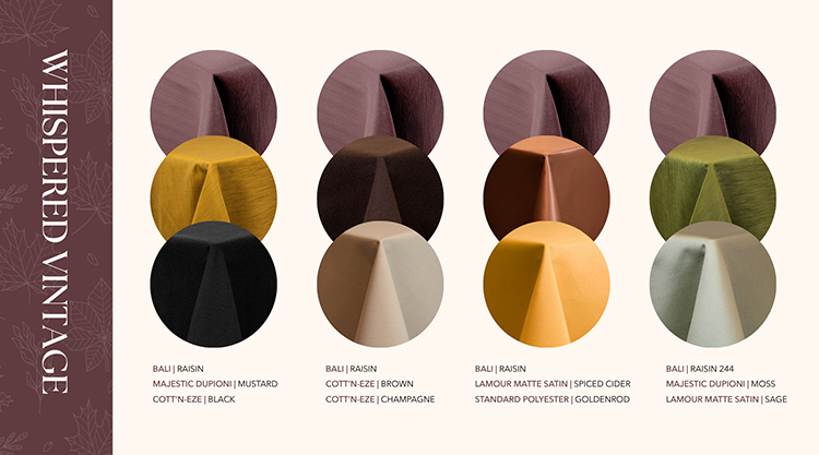
Pairing Highlights
Mustard + Black:
Adds retro contrast and a sense of graphic sophistication
Brown + Champagne:
Creates a warm, layered look with subtle sheen
Spiced Cider + Goldenrod:
Leans into cozy, harvest-inspired elegance
Moss + Sage:
Natural and calming, grounding the palette
in organic beauty
Why They Work
Whispered Vintage is rooted in soft purples, taupes, and blushes.
The pairings introduce rich contrast or tonal complements to keep designs from feeling overly delicate while still honoring the nostalgic mood.
![]()
Golden Hour
Warm. Joyful. Nostalgic.
Golden Hour’s rich yellows and golds come to life through pairings that bring balance, charm, and versatility.
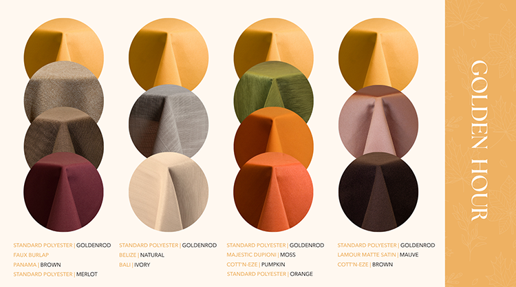
Pairing Highlights
Faux Burlap + Brown + Merlot:
Aged warmth with rustic chic
Natural Tones:
Grounded and minimalist, ideal for organic elegance
Mauve + Brown:
Romantic and vintage
Moss + Pumpkin + Orange:
Saturated and seasonally rich
Why They Work
Mustards and golds thrive with grounding elements like brown or earth tones, but shine when offset
with soft blush or deep wine.
Golden Hour pairings open the door to everything from farmhouse to formal.
![]()
Evening Mist
Cool. Modern. Moody.
Slate blues and soft greys get new dimension from pairings that range from subtle to statement-making.
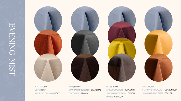
Pairing Highlights
Rust + Ivory:
A contemporary take on traditional fall warmth
Charcoal + Brown:
Sophisticated and masculine
Burgundy + Citron + Tobacco:
High drama with layered richness
Goldenrod + Copper:
Warm hues brighten the misty palette
Why They Work
Evening Mist’s cool palette invites warmth
through contrast.
These combinations build intrigue and add tonal complexity for elevated autumn settings.
![]()
Evergreen Retreat
Classic. Regal. Seasonal.
These pairings bring seasonal balance and creativity to this green-rich family, helping it feel both grounded and fresh.
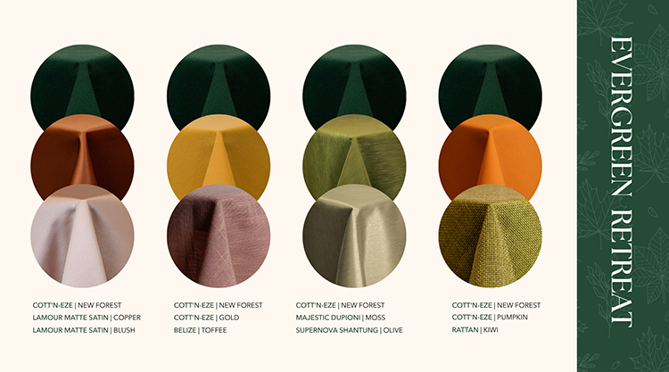
Pairing Highlights
Copper + Blush:
A surprising, upscale twist
Gold + Toffee:
Vintage elegance with retro flair
Moss + Olive:
A rich monochromatic statement
Pumpkin + Kiwi:
Playful and vibrant, perfect for modern fall aesthetics
Why They Work
Evergreen palettes excel when layered with
either softness or saturation.
These pairings provide both, allowing designers to create lush, storybook-inspired or trend-forward spaces.
![]()
Harvest Ember
Bold. Lively. Expressive.
These pairings allow Harvest Ember’s fiery oranges and rusts to shine while inviting new energy and range.
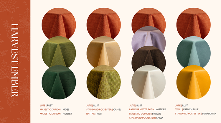
Pairing Highlights
Moss + Hunter Green:
Grounded greens that echo the natural fall landscape
Wisteria + Sand:
Unexpected softness for editorial or fashion-forward events
Camel + Kiwi:
Earthy yet playful, with a modern craft sensibility
French Blue + Sunflower:
A high-energy mix that’s perfect for vibrant or youthful designs
Why They Work
These contrasts showcase Harvest Ember’s ability to move between rustic and modern, playful and polished.
![]()
Hearthstone Classic
Grounded. Textured. Timeless.
These combinations bring out the rustic richness of the Hearthstone Classic palette, offering both drama and subtlety.
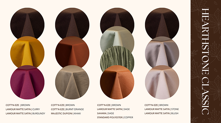
Pairing Highlights
Curry + Burgundy:
Saturated warmth that deepens the autumn palette
Burnt Orange + Khaki:
A classic, woodsy outdoor duo
Stone + Blush:
A contemporary, soft counterbalance to rugged brown tones
Sage + Copper:
Unexpected and elevated with a modern earth-tone twist
Why They Work
Hearthstone Classic’s brown-based palettes benefit from a mix of cool and warm elements.
These pairings keep the palette dynamic, versatile, and appropriate for both formal and rustic events.
![]()
Bring It All to Life
More Than Color, It’s An Event Roadmap
The fabric featured in each pairing is available across A1’s expansive fabric collection, making it easy to coordinate across layers and product types. So go ahead. Mix bold with subtle. Contrast warmth with calm. Pair vintage with modern. With A1’s Perfect Pairings, you’re not just designing, you’re composing a memorable experience.
Whether you’re planning a rustic wedding, curating a modern gathering, or designing an Autumn tablescape, A1’s Perfect Pairings offer a roadmap for creating scenes that are cohesive, compelling, and unmistakably Fall.